Yesterday I attended a seminar snappily titled Synthesis Report on Assessment and Feedback with Technology Enhancement held at University of Southampton. The aim of the seminar was to present the findings of a project commissioned by The Higher Education Academy looking at the use of technology to enhance assessment.
I have recently started a role at Southampton Solent University where I will be developing their study skills website succeed@solent so this seminar was perfect timing.
They handed out copies of Effective Assessment in a Digital Age: A guide to technology-enhanced assessment and feedback. The guide is full of great case studies and more importantly for me examples of how practitioners have assessed the success of projects. With reviewing succeed@solent I'm keen to evaluate it's effectiveness. From a quantitative perspective some of this should be straight forward; analysing stats and traffic but how does one judge whether a user has gained or learned anything from an online course? I'll be reading the guide to find out more so I can plan my own action research around the use and development of succeed@solent.
During the afternoon we took part in workshop activities where in small groups we had to redesign 'analogue' elements of a course and consider digital alternatives. The course was Leadership in Disaster Situations and the current assessment methods were written case studies with multiple-choice and open questions, a two day practical exercise in a woodland and a final written paper with open questions. In our groups we had to recommend how technology could be used to enhance the assessment and feedback of the course, provide a rationale for choices and evidence that the methods will have the desired impact, explain what evidence needed to be gathered to prove the benefit of the new technology and consider the impact on the tutor, students, central exams office and departmental manager. It was a lively session with lots of different ideas, ranging from student blogging to the use of virtual worlds such as Second Life. I felt that the workshop was missing one large chunk of information - the profile of the end user (student). How could we design a technological solution if we did not know about the user's needs? There were also valid comments about how technology is not always the best solution, for example if you want to learn how to build a shelter it's difficult to learn unless you're hands on.
The seminar also reminded me to visit HEA and JISC to find out if other learning providers have carried out research into online study skills and I made some useful contacts.
Also, a few colleagues from Solent's Learning Technology Unit were there so it was a good chance to make some new acquaintances and also get their take on online learning.
Thursday, 11 November 2010
Friday, 18 June 2010
BBC raw computers
Until last year I worked in BBC Factual and Learning as a Senior Content Producer for the Adult Learning team. One of my final projects was BBC raw computers; an interactive, immersive website aimed at complete computer beginners. It was an intensive two-year project for which we created interactive Flash videos with a presenter Tom teaching basic computer and internet skills.
As Senior Content Producer it was my responsibility to manage the project, including working closely with an independent production company RedNomad. In addition, due to having a teaching background, I took on the role of editor for scripts, wrote factsheets and managed user testing.
From the start of the project it was imperative that we put the user at the centre of the design process and brought in subject matter experts to provide critical reviews of scripts and factsheets.
raw computers is split into two main sections; Getting to know your computer and Introducing the internet which are then split into smaller sections, such as The mouse and Using email. Originally we had planned a separate section on health and safety, but I decided that as it should always be part of computer use, instead we covered key issues throughout raw computers.
In Computer basics we introduce the user to the computer's hardware and explain the importance of using equipment safely; adjusting seating and lighting appropriately, taking breaks and avoiding hazards. The presenter, Tom, explains this to the user on screen and there is also a factsheet they can print off and refer to, which I wrote.
In Registering on a website we explain about ensuring a website is secure and only providing the personal information users want to. We also cover security questions, usernames and passwords. With passwords we advise users to chose one that mixes letters and numbers, to use different passwords for different websites and to NEVER give your password out to anyone as no legitimate company will ever ask for it. There is also a Password checker game where you can test your password’s strength.
 Screen shot from BBC raw computers
In Using email we advise users to treat attachments from unknown sources with caution and explaine how to manage and file emails in folders.
The website has a range of accessibility options; all audio has subtitles, text on screen can be changed to three text sizes and six colours are available and there are text versions of the content for those who didn't want to use, or have, video on their computer. Also, we wrote the script with our target audience in mind; sentences were short, words with few syllables - making the content accessible for a low literacy audience.
BBC raw computers ended up being a lot of hard work, but it’s something that I’m very proud of. I hope users and practitioners have found it a useful tool for learning about using computers and the internet.
Using video to connect with the world
One of the outcomes of being restricted with travel for the past few months has been an exploration of using technology to communicate with people. In the past I’ve always preferred meeting people face to face, but with a leg in plaster it hasn’t been feasible.
As previously blogged I used Skype when in hospital to chat to family and friends and since then my peer Kathy and I have used it to chat with each other about the ITQ course, as well as regular sessions with our tutor Di.
A few weeks ago I was due to attend a meeting with The Reading Agency via a conference call. At the last minute a hospital appointment was rescheduled, so I jokingly said to them that I’d send them a video with my thoughts – they took me up on the offer! To start with I regretted my brash offering as I had not previously used the video and record facility on my Mac, or even uploaded a video. It was a frantic morning of testing the video and sound and familiarising myself with iMovie before uploading the final product to YouTube. It’s my first video and as it’s on project management it’s not particularly exciting, but I think it’s a useful demonstration of how technology can reduce barriers for people. Without the video I wouldn’t have been able to contribute to the meeting and it meant, even though I couldn’t travel, I could still be there ‘in person’.
My colleagues fed back that my video was very well received! However, on reflection, next time I would improve how I’d framed myself in shot and also make a shorter video – less for the audience to sit through! I will also spend time familiarising myself with iMovie, how to edit and compression options for uploading videos to YouTube, as mine took ages to upload.
Wednesday, 16 June 2010
Being online 247
Though I may moan a bit about Mac hardware (obviously it's the machine's fault I can't always get it to work... not the operator's!), I am quite addicted to being online 247. My main partner in crime is my iPhone which I've owned for over a year so it's starting to look a bit sorry for myself.
My partner, family and friends make jokes about how I have to be constantly plugged in and to some extent they're right.. but I have been known to leave technology behind (occasionally, with some disgruntlement). Though, the internet has also been my salvation.
 At the end of January I made the mistake of going ice-skating... a whole fifteen minutes in I fell over and fractured my tibia and fibula. The break is what Plymouthians would call 'a proper job'. Originally it had been expected I'd be in hospital for only a few days, before coming home with a cast and on crutches. But, what is known as 'Michelle luck' kicked in even more and I ended up being in hospital for four weeks, on a ward that was closed to visitors for three of those weeks. Life was not fun.
My salvation, and I really do mean this, was the internet on my iPhone and later on my Mac. Luckily, at the start of my stay, my mum had brought in my Mac with tv programmes and films loaded onto it (thanks awesome bro). As my hospital television did not work, it's all I had entertainment wise.
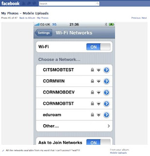 My iPhone was used by doctors to take photos of my leg (to see how the skin was progressing), people sent me pictures of the outside world, I emailed people tales of woe, updated the world on my progress via Facebook and received encouragement and support. And, I even made phonecalls. Luckily my iPhone contract had unlimited data (though recent news reports suggest this is all about to change), but frustratingly I could see numerous wireless networks no-one had the password to!
After two weeks - with no obvious 'escape' date scheduled, my mum posted me my broadband dongle. I loaded it up with credit and soon could chat with and see (hurrah!) friends and family via Skype, browse the web and generally keep in touch with the world.
I really believe that if I'd not had the internet the ordeal would have been far worse. Having technology and the internet to hand, be it accessed over 02's 3G network on my phone, or the Vodaphone's 2G network on my internet dongle, meant I could stay in touch with the people that mattered.
Tuesday, 15 June 2010
Online training - Apps and Benevolent Bill - part two
I rejoined the online training session to be introduced to the wonderful world of EduApps. Offered by JISC, these are a range of free software that can be used to support teachers and learners. A few caught my eye, particularly those for dyslexic learners and I was eager to learn more so watched their podcast and introduction video:
But, unfortunately the downloads are for Windows based PCs... not for a Mac :( I've added it to my ITQ TaDa list as after flicking through their AccessApps guide I'm eager to try them out once I'm back home, where I have a spare PC.
One interesting point they made was that for dyslexic people their colour preferences can change over time. I'd never heard of this before so it's useful to know, particularly when learners amend the settings on their computer, they'd need to be able to change them in the future.
For safety, Di recommended f.lux programme that adjusts the light on your computer's monitor depending on the time of day. This intrigues me, particularly as I get tired staring at a screen all day and it would reduce the glare. One to try when I get back to my flat.
Another website recommended was AbilityNet's My Computer My Way which shows users how they can change settings on their computer to make it easier to use. Great step-by-step walk-throughs on changing settings for vision, hearing, motor and cognitive skills for the Mac and PC.
The rest of the presentation was about the various units we have to complete for the module, including some suggested activities. I've decided I'm going to create my own activities with the aim of teaching myself more about the Mac operating system - though whilst always considering accessibility.
Sunday, 13 June 2010
Online training - Apps and Benevolent Bill
I've just started watching my second online training session; Apps and Benevolent Bill originally held on 8th March. This session links to the User Fundamentals Unit and I'll be blogging my thoughts as I (belatedly) take part:
System preferences - Universal Access
On a Mac, under System Preferences there is a Universal Access button. It was interesting to look at this to enable me to amend the computer to suit my needs, but it will be also be useful for working with learners.
Helpfully, the font in this window was larger than standard size. A user can change options for Seeing, Hearing, Keyboard, Mouse and Trackpad. I read through the different options and decided to change 'For difficulties seeing the cursor, Cursor Size' and moved it to just above Normal as sometimes I lose the cursor on the screen!

A learner I work with who is visually impaired would also find it helpful to change the size of her computer's cursor. As she uses a PC rather than a Mac I can refer to Jisc's Accessibility Features of Microsoft Windows® to check how to change cursor settings on her computer.
In the Hearing section you can select to flash the screen when an alert sounds, this would be helpful for learners with hearing impairment (such as my uncle). Using sticky keys or repeated key strokes will be helpful for users who would take time to press key combinations or might accidentally hit a key more than once.
WebbIE
WebbIE is a web browser for blind and visually impaired people. I hadn't come across this browser before, it's useful to know about. It displays a page as a plain text output in a window allowing the user to explore a page, follow links and complete forms. However, what surprised me about this was their guide to alt tags, recommending that web developers shouldn't use them. For a visually impaired user the information is superfluous as they can't see the image. However, I'd argue that as a visual user I often hover my cursor over an image to get more information about it from the alt tag. It was an interesting view point I'd not thought of before.
Webbie can also be used by web developers to test the accessibility of their website. This is really helpful for me as I also develop websites for companies.
Finally, the site contains lots of links to other great websites and programmes, such as Easy YouTube and screen readers.
Web browser accessibility
I didn't realise that there are so many accessibility options for web browsers. Di linked to a great summary list on Wikipedia comparing common accessibility features of web browsers.
I've viewed as far as Slide 5, have to stop now and start from Slide 6 of the presentation later.
Comment: I've noticed when I save images and upload they're rather degraded which can make text difficult to read. At present I'm using Grab on the Mac to take screen grabs as a tiff and then exporting as jpgs using iPhoto. I'll have to investigate to improve quality of the image.
System preferences - Universal Access
On a Mac, under System Preferences there is a Universal Access button. It was interesting to look at this to enable me to amend the computer to suit my needs, but it will be also be useful for working with learners.
Helpfully, the font in this window was larger than standard size. A user can change options for Seeing, Hearing, Keyboard, Mouse and Trackpad. I read through the different options and decided to change 'For difficulties seeing the cursor, Cursor Size' and moved it to just above Normal as sometimes I lose the cursor on the screen!

Screen grab from a Mac of Universal Access with Cursor Size changed to greater than Normal
A learner I work with who is visually impaired would also find it helpful to change the size of her computer's cursor. As she uses a PC rather than a Mac I can refer to Jisc's Accessibility Features of Microsoft Windows® to check how to change cursor settings on her computer.
In the Hearing section you can select to flash the screen when an alert sounds, this would be helpful for learners with hearing impairment (such as my uncle). Using sticky keys or repeated key strokes will be helpful for users who would take time to press key combinations or might accidentally hit a key more than once.
WebbIE
WebbIE is a web browser for blind and visually impaired people. I hadn't come across this browser before, it's useful to know about. It displays a page as a plain text output in a window allowing the user to explore a page, follow links and complete forms. However, what surprised me about this was their guide to alt tags, recommending that web developers shouldn't use them. For a visually impaired user the information is superfluous as they can't see the image. However, I'd argue that as a visual user I often hover my cursor over an image to get more information about it from the alt tag. It was an interesting view point I'd not thought of before.
Webbie can also be used by web developers to test the accessibility of their website. This is really helpful for me as I also develop websites for companies.
Finally, the site contains lots of links to other great websites and programmes, such as Easy YouTube and screen readers.
Web browser accessibility
I didn't realise that there are so many accessibility options for web browsers. Di linked to a great summary list on Wikipedia comparing common accessibility features of web browsers.
I've viewed as far as Slide 5, have to stop now and start from Slide 6 of the presentation later.
Comment: I've noticed when I save images and upload they're rather degraded which can make text difficult to read. At present I'm using Grab on the Mac to take screen grabs as a tiff and then exporting as jpgs using iPhoto. I'll have to investigate to improve quality of the image.
Sunday, 6 June 2010
User fundamentals - accessibility on a Mac
Last November I needed to buy a new laptop and as my grandfather gave me his old iMac and I owned an iPhone the logical step was to purchase a MacBook Pro. Getting to grips with a new operating system has been quite challenging, particularly as I've only ever used a PC before.
Over the last ten years I've had a physical problem with my arms and hands which leads to discomfort if I repeatedly carry out the same action. Due to this I had taught myself to navigate through an operating system using only the keyboard, to rest my hands from using a mouse. However, I learnt this on a PC, now I have to get to grips with a Mac.
On a PC to get up to the menu bar in an application I would use keyboard shortcuts, but the same shortcuts don't work on a Mac. To find out which shortcuts I could use I visited the Apple website to read about how the Mac's operating system comes with a variety of assistive technologies. This gave a good overview, but I had to visit the Mac OS keyboard shortcuts page to get more specific information.
I tried some of the shortcuts, but frustratingly they didn't always work! I mentioned this to my tutor, Di Dawson, who helpfully found out that to get to get to the menu bar I needed to use the keys fn (function) + ctrl (control) + F2 (function 2). This is an extra key in comparison to on a PC and annoyingly I find it difficult to do with one hand.
Once I figured this out, I could then open and shut down my computer just using my keyboard. My peer, Kathy observed me opening and shutting down the computer and wrote a witness statement.
To close down applications I used cmd + Q or fn + ctrl + F2 to access the menu bar and then use the arrow keys to navigate around the menu, the enter key to select an action and then close the application. Finally I used fn + ctrl + F2 to access the Apple menu and then close the computer.
I'm disappointed that the Mac website doesn't provide all the information I need on keyboard shortcuts, I think the way forward is to ask other people for advice, such as using forums.
Update: I've just figured out how to reduce the number of keys I have to hit. I've changed a setting in System Preferences under Keyboard so that Function keys only work as standard function keys. For example, to access the menu bar is now only ctrl + F2 - which I can do with one hand, hurrah!
Saturday, 5 June 2010
User fundamentals - Kathy - Witness testimony
For the ITQ we have to use a variety of assessment methods for our portfolio, two of which are witness testimony and observation. For the user fundamentals module I have observed Kathy using correct procedures to start and shutdown an IT system.
Kathy gave herself the additional challenge of operating her laptop without the use of a touchpad or mouse.
To shut down the laptop Kathy first ensured all Word documents on the screen were saved, using the shortcut keys Ctrl S to save documents. For any documents unnamed she was able to give the documents name and then using the tab and enter keys select folders to save them in. Once she had saved her Word documents she used Alt F4 to close Word. If Kathy had just shut down Word her documents might not have saved in the correct place on her computer and she might not have been able to easily find them again.
Next Kathy used Alt F4 to shut down Internet Explorer.
Finally she used the Windows key on the keyboard to bring up the Start menu and then used shift and tab to move to the shut-down button and hit enter to close down the laptop.
To restart her laptop Kathy turned on the power button and then entered her password and hit return.
I asked Kathy how she found the process and she believed it was good to experience how to operate a computer without using a mouse, as some of her students often have to do this.
Sunday, 30 May 2010
Word - using and not using tables
When I create lesson plans for teaching I use tables to format the layout of the page to make it easier to read for myself. For example, when I created a session plan for a BBC My Story workshop I used tables to list the resources required and layout the session plan so it was easy to refer to when teaching.
At the time I worked at the BBC and wanted to share the resource with a wider audience by uploading it online to a tutors' area on BBC raw. Before doing this I formatted the document using Styles and removed text from tables and instead listed information. By extracting the information from tables it made it more accessible to screen reader users, who'd otherwise have the information read to them from left to right linearly. Having the text listed instead made the information easier to comprehend.
The amended version of the session plan was branded and then uploaded online.
Update: Kathy reviewed my document, I found her feedback really helpful. I hadn't realised that documents created on a PC and a Mac showed up such differences. Also, she's right ensuring I was consistent with my use of headings and Styles throughout the document. I'll make a concerted effort to do this in the future!
Saturday, 29 May 2010
Word - creating a multi-page document
A report I've co-written for The Reading Agency needs to be formatted inline with their house style and template. Whilst I format the document I will also aim to make it as accessible as possible, but may be limited by the house style. Below is a commentary of the steps I took to format the document.
Accessing the template
First I accessed the template from Basecamp, a web-based project management software where users can manage tasks and store files. Unfortunately the Fonts I needed were not on Basecamp so I couldn't download, but they were embedded into the template.
Copying the text across
Formatting footnotes
Remove non-printing characters
Images
 Colour blindness simulator
Document properties
I went to File > Properties > Summary to add information about the document, to improve Search Engine Optimisation. Unfortunately, due to the non-standard Styles used for headings and sub-headings the Document contents did not show all the chapters.
Appendices
The appendixes were PDF from online surveys that were carried out for the study. I wanted to bring the separate main document and appendices into one document. I used a free online conversion tool, Zamzar to convert the PDF into a Word document, but it was unusable as the layout of questions and answers were all over the place. My only other option was to insert each page of the PDF as images into the document. This was not ideal as the images were large and in Word for a Mac there are no options to compress the image. Also, having the appendices as images is not ideal for screen reader users, but I couldn't think of any other solution. But I felt the reader would not miss out if they could not access these as they supplemented the main document.
Converting to PDF
Finally I converted the document to PDF using the inbuilt converter in Mac. Unlike Word for the PC, it does not offer any options for enabling accessibility when converted.
Difficulties
Conclusion
This whole process took me at least 8 hours - very time consuming! It's quite frustrating that even after all my changes, the final document isn't as fully accessible as it could be, I've been hindered by using Word on a Mac and The Reading Agency's template.
On reflection it would be much easier to correctly format a document as it was created. Also, a correctly formatted template with comprehensive Styles would make it easier to use. Finally, next time I would use Word on a PC!
There are links to the original version of the report and final Word and PDF version.
I'll ask my peer Kathy to review my document.
Accessing the template
First I accessed the template from Basecamp, a web-based project management software where users can manage tasks and store files. Unfortunately the Fonts I needed were not on Basecamp so I couldn't download, but they were embedded into the template.
Copying the text across
- To copy the text into the template I opened the .dot template and saved as a Word document.
- Then from the original report I selected Edit > Paste Special and chose Unformatted Text to remove the formatting. However, this didn't copy all the images.
- I undid the last action and then copied the text over.
- I used the keyboard shortcut cmd A to select all the text used the dropdown menu on the Styles toolbar to Clear Formatting. This did not remove the images, but the footnotes were still in the old format.
Formatting footnotes
- I Googled 'select all footnotes in word' and found a forum where instructions were given in how to select all the footnotes at once. I realised I could search by Style, as the footnotes had the style Footnote Text.
- As I'm using a Mac, the method was slightly different to the one described, but I figured it out. I had to go to Edit > Find > Format: Style > Footnote Text > OK. Then using the Styles dropdown menu I selected the template Style Page Footer. This changed all the text, bar the hyperlinks to LuMarc Com 11 and right justified the text.
- I disliked the layout of right justified text so I selected all the text again and justified to the left.
- However, not all the text was formatted so I had to go in and individually select and apply Page Footer style.
- Also, I noticed that all the Footnote Marks were now formatted as 'normal' text so I had to select them all and change to Format > Font > Effects > Subscript.
Remove non-printing characters
- Next I needed to remove any double paragraph marks. I used Find and Replace to select Find > Special > Paragraph Mark and entered twice the paragraph mark: ^p^p.
- Rather than using Paragraph Mark if additional space between paragraphs were required, I formatted text using Format > Paragraph > Spacing > Before & After: 6pt.
- This made the document into quite a mess! So I had to go through and add in single Paragraph Marks to distinguish between paragraphs. To do this I had the original document on the left so I could see where the paragraphs were in the text. After going through a page I would then change the style by selecting the text and choosing the style from the drop-down menu.
- After a while I realised it would have been quicker just to change all the text to the Style Body Text and then format if different, so I did that for the remainder of the document.
Images
- Originally when I labelled the images I just typed in text. For this version of the document I added captions to all the images (select image, Insert > Caption), though the caption numbers always defaulted to 1 and I had to manually edit them. I couldn't figure out why this happened (even after Googling).
- The default Style for Caption text was font colour blue and size 9pt. I modified the Caption Style to black size 11pt, to fit in with the rest of the document and make easier to read.
- Some images were quite close to the text so I formatted paragraphs following images so there was more space before the paragraph started.
- I could not add alternative text as this function is not available in Word for the Mac.
- I had taken the images from screen-shots around the web and they weren't of the highest quality. I also optimised them for the document (using iPhoto) so they became degraded. Next time I go through this process, I will strive to obtain better quality images.
- Even though I could not change the images, I thought it would be interesting to use a colour blindness simulator to test how they'd look for users with colour blindness. The simulator showed the original and 'simulated' image and not all the images I'd selected were well defined for users with colour blindness, but the majority where:
 Colour blindness simulator
Document properties
I went to File > Properties > Summary to add information about the document, to improve Search Engine Optimisation. Unfortunately, due to the non-standard Styles used for headings and sub-headings the Document contents did not show all the chapters.
Appendices
The appendixes were PDF from online surveys that were carried out for the study. I wanted to bring the separate main document and appendices into one document. I used a free online conversion tool, Zamzar to convert the PDF into a Word document, but it was unusable as the layout of questions and answers were all over the place. My only other option was to insert each page of the PDF as images into the document. This was not ideal as the images were large and in Word for a Mac there are no options to compress the image. Also, having the appendices as images is not ideal for screen reader users, but I couldn't think of any other solution. But I felt the reader would not miss out if they could not access these as they supplemented the main document.
Converting to PDF
Finally I converted the document to PDF using the inbuilt converter in Mac. Unlike Word for the PC, it does not offer any options for enabling accessibility when converted.
Difficulties
- Later I realised some of the Footnote Marks I had originally formatted I'd then changed to Body Text, so I manually changed them to Subscript as using the Select All method did not seem to work.
- Next I realised the italics for titles of books, games etc. had been removed from the Body Text so I again used the Find > Special function to highlight all the text in italics in the original document so I could then compare and amend in the second document.
- Because the Styles are not formatted as Heading 1, 2 etc. I was unable to automatically generate a contents list for the document. I thought this might have be an issue. Instead I had to format the existing contents list. Originally the page numbers were justified to the right of the page, but this would have made it more difficult for users with magnification on to read the text. Also, tabs had been used to format the layout so if a user amended the text size the layout of the document could be lost. I amended the layout by moving the page number next to the title of each section.
- Strangely, one of the images flipped when I pasted it into the template - very odd. I copied again from the original document and chose Paste Special and selected Picture, this stopped it happening.
Conclusion
This whole process took me at least 8 hours - very time consuming! It's quite frustrating that even after all my changes, the final document isn't as fully accessible as it could be, I've been hindered by using Word on a Mac and The Reading Agency's template.
On reflection it would be much easier to correctly format a document as it was created. Also, a correctly formatted template with comprehensive Styles would make it easier to use. Finally, next time I would use Word on a PC!
There are links to the original version of the report and final Word and PDF version.
I'll ask my peer Kathy to review my document.
Wednesday, 26 May 2010
Word - reviewing a template
I've recently contributed to a report created in Word that I want to make accessible. The document has to be formatted using the house style for The Reading Agency. Before formatting the document, I'm going to review the house style template and comment on elements of accessibility I’ll need to consider, referring to JISC TechDis Accessibility Essential series.
Appropriate use of fonts: font styles
The body text is set to default font size of 11pt, but it is recommended that text should be no smaller than 12pt.
The body text font is LuMarc Roman that is a serif font, it has the small features called ‘serifs’ at the end of strokes. This can be more difficult for users to read when viewed digitally as the fine details of the serifs can be distorted (en.wikipedia.org/wiki/Serif#Usage). Studies online have also shown that sans-serif fonts such as Verdana (house style’s default font) are more readable online (www.wilsonweb.com/wmt6/html-email-fonts.htm). With many more people downloading documents and reading them off a screen, it would be worth considering moving to a sans-serif font.
Appropriate use of fonts: font colours and contrast issues
The Reading Agency logo uses Futura Bold font (sans-serif) and a dark and light green colour:
 The Reading Agency’s colour logo
Individuals prefer different set-ups when viewing colours of documents. For example when viewing a black text Word document I prefer to change the background colour to off-white as it reduces the contrast and strain on my eyes.
It is recommended that there should be good contrast between the font colour and background colour. When The Reading Agency’s logo is used on a white background the contrast is quite low on the light green letters and perhaps will not be as readable. I tested this theory by converting the Pantone colour PMS 358 U to RGB colour values (red/green/blue) and Hexadecimal colour values. Next I entered the foreground value (light green) #AADD96 and the background value (white) #FFFFFF into a colour checker. It gave the following results:
“Brightness: The difference in brightness between your foreground and background colours is 57 and is therefore insufficient. The World Wide Web Consortium (W3C) recommends a standard of 125 or greater.
Contrast: The contrast between your foreground and background colours is 224 and is therefore insufficient. The W3C recommends a standard of 500 or greater.”
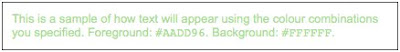 A sample of how text will appear using The Reading Agency’s colour combinations of light green on a white background.
The logo uses a dark green on the first letters that may be indistinguishable to the light green letters for colour blind users.
Structuring documents: styles
The template uses Styles to distinguish heading text, sub headings and paragraph headings. These headings will make it easier for users to navigate through a document. For example, screen readers can jump to headings. Also, users can quickly amend the displayed styles to suit their own preferences.
In addition, when exported to html or PDF the document will maintain its structure (if using an appropriate convertor).
Also, if structured appropriately, internal links can be created using headings.
Headings can also be used to automatically create a table of contents.
However, the template does not use Heading 1, Heading 2 for Style names, instead it uses terms such as sub-heading, para heading. I do not know whether this will affect usability, I won’t be able to check until I’ve created a multi-page document using the template. But I'm assuming as it's not standard as in html (H1, H2 etc.) there will be some drawbacks. Update: I created a multipage document and then tried to automatically generate a contents page. I couldn’t because the headers styles were not recognized. Search engines give the words used in the various headings more weight, so it helps TRA documents appear in searches (for more info. on SEO see below).
Best practice with images
There is no guidance on the use of images within documents. Suitable images should be selected and can be made more accessible by:
Best practice with hyperlinks
There is no guidance on the use of hyperlinks within documents.
Best practice for Search Engine Optimisation (SEO)
There is no guidance on optimizing a document for SEO. Not obviously an accessibility issue, but good SEO for a document will help users find and access the information. The Reading Agency will want their documents to appear in online searchers. It is recommended that:
It is recommended that documents are exported to PDF before being sent externally. However, there are no recommendations about ensuring accessibility of a document is transferred across to a PDF, such as structure, image alternative text, bookmarks and reflow enabled.
Cutepdf Writer is recommended as the convertor to use, however this PDF writer does not transfer bookmarks, document structure, allow reflow or alternative text for images.
Summary
In summary, it is incredibly helpful that a template and guidance already exists for the organisation. However, there are a few areas they could consider changing which would make documents more accessible to a wider audience:
Also, for future work, I would recommend they investigate, simulate and test materials for users with accessibility needs.
Appropriate use of fonts: font styles
The body text is set to default font size of 11pt, but it is recommended that text should be no smaller than 12pt.
The body text font is LuMarc Roman that is a serif font, it has the small features called ‘serifs’ at the end of strokes. This can be more difficult for users to read when viewed digitally as the fine details of the serifs can be distorted (en.wikipedia.org/wiki/Serif#Usage). Studies online have also shown that sans-serif fonts such as Verdana (house style’s default font) are more readable online (www.wilsonweb.com/wmt6/html-email-fonts.htm). With many more people downloading documents and reading them off a screen, it would be worth considering moving to a sans-serif font.
Appropriate use of fonts: font colours and contrast issues
The Reading Agency logo uses Futura Bold font (sans-serif) and a dark and light green colour:
 The Reading Agency’s colour logo
Individuals prefer different set-ups when viewing colours of documents. For example when viewing a black text Word document I prefer to change the background colour to off-white as it reduces the contrast and strain on my eyes.
It is recommended that there should be good contrast between the font colour and background colour. When The Reading Agency’s logo is used on a white background the contrast is quite low on the light green letters and perhaps will not be as readable. I tested this theory by converting the Pantone colour PMS 358 U to RGB colour values (red/green/blue) and Hexadecimal colour values. Next I entered the foreground value (light green) #AADD96 and the background value (white) #FFFFFF into a colour checker. It gave the following results:
“Brightness: The difference in brightness between your foreground and background colours is 57 and is therefore insufficient. The World Wide Web Consortium (W3C) recommends a standard of 125 or greater.
Contrast: The contrast between your foreground and background colours is 224 and is therefore insufficient. The W3C recommends a standard of 500 or greater.”
 A sample of how text will appear using The Reading Agency’s colour combinations of light green on a white background.
The logo uses a dark green on the first letters that may be indistinguishable to the light green letters for colour blind users.
Structuring documents: styles
The template uses Styles to distinguish heading text, sub headings and paragraph headings. These headings will make it easier for users to navigate through a document. For example, screen readers can jump to headings. Also, users can quickly amend the displayed styles to suit their own preferences.
In addition, when exported to html or PDF the document will maintain its structure (if using an appropriate convertor).
Also, if structured appropriately, internal links can be created using headings.
Headings can also be used to automatically create a table of contents.
However, the template does not use Heading 1, Heading 2 for Style names, instead it uses terms such as sub-heading, para heading. I do not know whether this will affect usability, I won’t be able to check until I’ve created a multi-page document using the template. But I'm assuming as it's not standard as in html (H1, H2 etc.) there will be some drawbacks. Update: I created a multipage document and then tried to automatically generate a contents page. I couldn’t because the headers styles were not recognized. Search engines give the words used in the various headings more weight, so it helps TRA documents appear in searches (for more info. on SEO see below).
Best practice with images
There is no guidance on the use of images within documents. Suitable images should be selected and can be made more accessible by:
- Selecting images that contain high contrast
- Using alternative text
- Inserting appropriate captions
Best practice with hyperlinks
There is no guidance on the use of hyperlinks within documents.
Best practice for Search Engine Optimisation (SEO)
There is no guidance on optimizing a document for SEO. Not obviously an accessibility issue, but good SEO for a document will help users find and access the information. The Reading Agency will want their documents to appear in online searchers. It is recommended that:
- Style attributes such as H1, H2 (semantics) are used as it makes it easier for a search engine to determine the topic of the document. Search engines give the words used in the various headings more weight in terms of search.
- Document properties should be completed including Title, Subject, Author etc. For example, at present The Reading Agency’s templates show the Company as Cog Design rather than The Reading Agency – for more information: http://www.seoconsultants.com/document/seo#Microsoft-Word
- The Title data is particularly important as this is what will come up in search engine results.
It is recommended that documents are exported to PDF before being sent externally. However, there are no recommendations about ensuring accessibility of a document is transferred across to a PDF, such as structure, image alternative text, bookmarks and reflow enabled.
Cutepdf Writer is recommended as the convertor to use, however this PDF writer does not transfer bookmarks, document structure, allow reflow or alternative text for images.
Summary
In summary, it is incredibly helpful that a template and guidance already exists for the organisation. However, there are a few areas they could consider changing which would make documents more accessible to a wider audience:
- Change the body font to a sans-serif font.
- Change the default font size to 12pt.
- Create a default template that uses an off-white background, to reduce the contrast.
- Improve the brightness and contrast of The Reading Agency’s logo on a white background.
- Amend the logo so it does not rely on colour to communicate ‘TRA’.
- Change the Styles to standard names such as Heading 1, Heading 2 etc.
- Update template guide to include guidance on including images in documents and making them accessible.
- Update template guide to include guidance on use of hyperlinks and making them accessible.
- Update template guide to include guidance on making document optimized for search engines.
- Update template guide to include guidance on keeping accessibility when creating a PDF.
- Use a PDF convertor that offers accessibility benefits to users (www.techdis.ac.uk/index.php?p=3_20_2_2).
- Use tools to run checks on the accessibility of documents, such as the Word 2010 Accessibility Checker and using the Adobe Accessibility PDF checker.
Also, for future work, I would recommend they investigate, simulate and test materials for users with accessibility needs.
Monday, 24 May 2010
Word - creating and testing accessible documents
As evidence for the course I've created a one page accessible document. Actually, it's only half a page long - but I thought I'd start small!
I currently work for The Reading Agency and regularly produce documents for them. They have a template guide for documents which includes the use of Styles in Word. An appropriately structured document benefits all users, but can be particularly beneficial to disabled users because:
Working in Word on a Mac is often slightly different to using a PC. For example, to view the Document map I have to select: View menu > Navigation pane, then Navigation pane > dropdown menu Document map. In Word for a PC it's just View menu > Document map - much simpler!
Another issue with Word on a Mac is that you cannot add alternative text to images. It's good practice to add alternative text for users who have print related difficulties as screen readers read out the alternative text. Also visually impaired users who magnify documents can benefit from an image description rather than scrolling between the alternative text and image. On the template I'm using the header containing The Reading Agency's logo, but I have no method of adding alternative text 'The Reading Agency logo'. Two solutions would be to either remove the logo or ask a colleague with Word for a PC to add alternative text. My solution on this occassion was to add '..being run by The Reading Agency' to the body text to indicate that this organisation had created the document. In a previous version of the document, the name of The Reading Agency was only in the header logo.
Another frustration is not being able to user test a document. I used to work at BBC Learning where we'd create websites for adult learners. As part of the development process we would test websites on different browsers and using different technology such as screen-readers. It's frustrating not to be able to do the same in Word. I'd like to experience 'jumping' from one header to the next, but haven't come across some free software which would replicate this experience for me on a Mac. But, through hunting around I did find NonVisual Desktop Access for the PC and a great web-based screen reader called WebAnywhere - I'm planning to show the later to some students.
I've sent the incredibly short document to my peer Kathy, I'm looking forward to her feedback.
P.S. For this post I created a Dropbox account to enable me to share documents with my peer, Assessor and IV. I chose to use Dropbox as it uses cloud computing and I can save documents in a public folder, in which I can add document I want to share with other internet users. Dropbox generates URLs which I can link to so users can download documents, as I've done at the top of this blog.
I currently work for The Reading Agency and regularly produce documents for them. They have a template guide for documents which includes the use of Styles in Word. An appropriately structured document benefits all users, but can be particularly beneficial to disabled users because:
- A Document Map can be used to navigate through a structured document
- Screen readers can jump to sections tagged as 'heading'
- A document can be quickly amended by the author or user, to amend display styles such as fonts
- When exported to a PDF the headings create a navigation structure for the PDF
- A motor impaired user can navigate through a document using minimal input
- Headings can be used to automatically generate a table of contents, improving productivity
Working in Word on a Mac is often slightly different to using a PC. For example, to view the Document map I have to select: View menu > Navigation pane, then Navigation pane > dropdown menu Document map. In Word for a PC it's just View menu > Document map - much simpler!
Another issue with Word on a Mac is that you cannot add alternative text to images. It's good practice to add alternative text for users who have print related difficulties as screen readers read out the alternative text. Also visually impaired users who magnify documents can benefit from an image description rather than scrolling between the alternative text and image. On the template I'm using the header containing The Reading Agency's logo, but I have no method of adding alternative text 'The Reading Agency logo'. Two solutions would be to either remove the logo or ask a colleague with Word for a PC to add alternative text. My solution on this occassion was to add '..being run by The Reading Agency' to the body text to indicate that this organisation had created the document. In a previous version of the document, the name of The Reading Agency was only in the header logo.
Another frustration is not being able to user test a document. I used to work at BBC Learning where we'd create websites for adult learners. As part of the development process we would test websites on different browsers and using different technology such as screen-readers. It's frustrating not to be able to do the same in Word. I'd like to experience 'jumping' from one header to the next, but haven't come across some free software which would replicate this experience for me on a Mac. But, through hunting around I did find NonVisual Desktop Access for the PC and a great web-based screen reader called WebAnywhere - I'm planning to show the later to some students.
I've sent the incredibly short document to my peer Kathy, I'm looking forward to her feedback.
P.S. For this post I created a Dropbox account to enable me to share documents with my peer, Assessor and IV. I chose to use Dropbox as it uses cloud computing and I can save documents in a public folder, in which I can add document I want to share with other internet users. Dropbox generates URLs which I can link to so users can download documents, as I've done at the top of this blog.
Wednesday, 19 May 2010
Second Life
In the last few weeks I've been taking tentative steps into the virtual world of Second Life. I've been tempted to join as RaPAL (Research and Practice in Adult Literacy) are holding a conference in July at which I'll be running a workshop and evening seminar. The conference is called Multiliteracies - Changing literacies, changing worlds and I'll be presenting a recent study I helped carry out into gaming and reading, using gaming to engage and motivate reluctant adult readers.
As part of the event they are holding pre-conference get togethers in Second Life. I joined a few weeks ago and it took me back to being a complete internet newbie - I felt fear. When you join Second Life you start in the welcome area and other avatars start talking to you - I was scared! I wanted to go somewhere safe to get used to moving around, so teleported to the Open University's island. It reminded me of what new internet users must feel; complete panic, scared of everyone and everything and little knowledge of how to navigate. Bex, from Cornwall College kindly met up with me and gave me a tour of Second Life - thank you Bex! Cornwall College have been exploring the use of Second Life with HE students. LSIS have just published an informative case study on Cornwall College's use of virtual worlds.
But what has this really got to do with accessibility? Well, at the moment I'm resting because a few months ago I badly broke my leg. After a month in hospital before moving onto hopping with a walking frame, I'm finally on crutches but mobility is limited. Being in Second Life I can walk, run and even fly - it's quite liberating. Added to that, Cornwall College has an island which is landscaped to echo its real-life equivalent and it's made me quite homesick for my flat in Cornwall that I currently can't get to.
Through using Second Life I was able to attend a discussion with contributors from across the world. In real life this is something I currently can't do.
 Taking part in a discussion in Second Life
I'm quite excited by the possibilities in Second Life, particularly around accessibility and am planning to learn more.
Tuesday, 18 May 2010
Word - checking accessibility
Peer reviewing is a great way to learn gain greater insight into learning outcomes for an assignment and also improve your own skills.
My peer and I, Kathy, have decided to review each other's work to help us meet course learning outcomes and support each other.
Yesterday she sent me a 'before' and 'after' version of Word document she had created and I'm going to critically appraise its accessibility. To start with, I searched online for guidance on critique the accessibility of Word documents and thought I'd use IBM's document checklist.
Images
When creating Word documents it's good practice to add alternative text for an image. This is possible in Word 2000 and 2007 for a PC, but not the Mac version so this is something I can't go into the images to check.
In the original document the images are not labelled consistently, this has been done in the second document. However, the labels aren't very descriptive. Kathy has chosen quite a tricky document, explaining how to use a computer programme through the use of screen-grabs and text. A true alternative version would need to be created for visually impaired users describing their navigation around the system. For example instead of 'Figure 1 - Login Screen', 'Figure 1 - Login screen with two text enabled fields. The first is for entering a username and the second is for entering a password'. Writing alternative text is quite an art as you have to remember the user may not be able to see the image so you have to describe / explain the important parts. It's a skill I'm constantly trying to improve.
However, I can roll over the images to see the alternative text. Kathy has creatively used this to give instructions, for example on one image giving the user a prompt to 'choose a good image as this will identify you'. Ideally instead the alternative text should serve the equivalent purpose of the information supplied in the image. Particularly as users are unlikely to roll over an image to get instructions.
At the top of the document a header image has been used which contains a brand name, email address and phone number. This information does not need to be in an image and could be taken out and added to the document as text.
Document structure
The first document contains some use of styles, whereas the second document is consistent with the use of 'Heading 1', 'Heading 2' and 'Heading 3' which will aid navigation for screen-reader users.
Where hyperlinks are given the full URL is the text on the page which identifies the purpose of each link. This is useful for screen readers and for other learners who I imagine would print out the document.
Navigation
The document is 10 pages long and does not include a table of contents, which would be useful for navigation.
Colour
The original document is predominantly black text on a white background. In the 'after' version it is light blue text on a white background which I find more difficult to read as there is less contrast.
In comparison to the original document, some text information has been formatted to blue text in a text box with a sand coloured background. This looks very appealing to the eye, but text in a text box doesn't change when a whole document's text is reformatted or the background colour changed to suit the learner. It's preferable to not have information in a text box.
To emphasise a point sometimes words are put in underline. I would leave these just as bold as it suggests the web convention of them being hyperlinks.
Layout
I found the layout of the document easy to read as for the majority of time paragraphs were not split over pages.
On the original document the images were small and randomly on the left or right hand side of the page. In the second document the images were laid out more uniformally which made it easier to read.
On the original often red labelling arrows went over the body text, this was removed in the second document making it easier to read.
Some of the text boxes bled over the print margin of the page, this could mean only part of the document and information printed out.
Interactive
The final part of the document has some interaction where a user can rate the document. I didn't quite understand how to answer some of the questions, it looks like the drop down boxes don't work. I couldn't get the radio buttons to work either.
Kathy also sent over a web version of the document. I'm not sure how this makes a document more accessible but all options are always worth exploring! I opened the file, but text was laid ontop of each other so there maybe a compatibility issue between my Mac and her PC as I know it was legible on her computer.
I found reviewing the document a really useful exercise as it gives me plenty to think about when creating mine!
Saturday, 15 May 2010
Open Library
I came across an interesting website the other day called Open Library which aims to publish one web page for every book. An open source project, so far they have amassed over 20 million records and with contributions from libraries and individuals around the world and the collection is growing.
I was intrigued by their blog post Over 1 Million Digital Books Now Available Free to the Print-Disabled and read more. They've thoroughly tested their website and ensured it's accessible, but more importantly are excited about the accessible books.
They have an Accessible book subject page where you can search through titles, I took at look at their copies of Alice In Wonderland - they have over 615 editions! When I initially clicked on 'Read online' it took me to a non-English version of the book so I then had to look at the edition list. Many editions are available in a text only or PDF (though not marked up) format. However, many are downloadable DAISY files. DAISY (Digital Accessible Information System) is a talking book format for people who wish to hear and navigate through text. Unlike audio books, users can navigate through chapters or books and turn back or forwards a page. This resource could be immensely useful for learners I work with who are print-disabled due to dyslexia or are otherwise visually impaired.
Some of the books available in DAISY format are only available to US residents, but so far my searches have shown that other editions of a title freely exist to all users. Also I did find the site a little tricky to navigate at times as their search parameters aren't specific enough; I couldn't for example search for Alice in Wonderland by latest edition with PDF. I can imagine I would first have to show a learner how to use the website.
DAISY was a new concept for me, they helpfully linked to a great introduction video where users explained its benefits:
P.S. First embedded video on blog! Shame that a video about accessibility doesn't include subtitles.
P.P.S. I just hacked this blog's template so the video would fit in the width of the main text. To be honest, I don't know too much about CSS so it was a bit of a guess, but it seems to have worked!
Thursday, 6 May 2010
Talking with a user about their experiences
Due to being at home with a mending leg (I'm trying to be positive, I don't like to call it a broken leg!) I'm not in direct contact with any of the students I normally support. As part of this course I had hoped to speak with them about their experiences of using technology, in particular if they had any accessibility issues.
Today my uncle popped round to give me a lift to the hospital and we got chatting about his use of technology and being dyslexic, how he adapts his computer to suits his needs. My uncle was diagnosed late in life and it's something we've never really spoken about, even with my background in this area. It was interesting to find out how he's come up with his own method of getting round 'annoying' websites that just 'flash and distract' him. Sometimes, he finds these animated adverts so distracting he can't read the information on the page, so he copies the main text into Word so that he can focus on just the text.
Another strategy he uses is for spelling, over time he has built up his own spelling dictionary which he has saved in a Word document. When he's composing some writing he keeps this document open as a reference, as he knows he has already found the correct spellings of such words. His approach suggests he'd find using a standard dictionary quite difficult. I'm thinking of buying a copy of the ACE Spelling Dictionary to see if he'd find that any easier to use.

I've used the ACE Spelling Dictionary with dyslexic learners before and to be honest I've found it quite useful myself. To find a word you need to listen to how many syllables it's broken up into and listen to the first syllable and what sound it makes. Then you find that sound in the dictionary and the word by the number of syllables. To be honest it's a bit difficult to describe and much simpler to show! If you ever come across a copy of this book, do take a look.
Next our conversation led onto colours, he's found that using a green colour scheme makes it easier to read text and wishes that there was some magic way he could make web pages green. I was able to tell him there is, in the form of an application, I just need to first learn how to use it on this course! So now I have even more motivation to get me going with this, over the next few weeks I'm planning to show him how to create templates in Word and Excel, amend fonts sizes and colours in his browser and look at cover overlay tools.
Instead of looking to my learners for feedback, I should have looked closer to home.
P.S. I've decided I quite like adding images into these blog posts. I'm quite a visual learner, for example I could remember what an ACE Spelling Dictionary looked like, but not what it was called.
Tuesday, 4 May 2010
Making libraries accessible to dyslexics
As I work for The Reading Agency I'm subscribed to a number of different JISC mailing lists. One recent discussion has been around making libraries accessible to users with dyslexia. Amongst the common comments such as reducing the risk of fluorescent lighting, there's also been an interesting post about the use of QR codes.
Now I've seen QR Codes before, but have never really understood their purpose or seen a useful application. However, the University of Bath are using them to aid library users to capture information and then carry it with them to find a book on a shelf. Many a time I've written down book information on a scrap of paper, only to find my scratchings unintelligible when I get to the shelves.
A Quick Response, or QR, code is like a barcode. If you have a QR application installed on your mobile phone you can use it to scan (take a picture) of the barcode and then it links your phone to a particular webpage or content. So, at the library you can browse the catalogue, take a snap of the QR, upload it to your phone and then take the information with you to the shelf.
 Example of a QR code
But how does this help dyslexic library users? I'll let Dr Simon Ball from JISC explain:
"No issues with mis-transcribing classification codes, or with trying to work out complicated names, as they can then just walk along the shelf until what is showing on their phone matches what is showing on the shelf."
A brilliant idea.
Bath University Library: www.bath.ac.uk/library/services/qrcode.html
P.S. My first image inserted into blogger! To make it accessible I added an alt tag description to the code: alt="Example of a Quick Response code"
Monday, 3 May 2010
Amazing Word
Due to a slight misfortune with a broken leg (doh) I'm taking part in the online delivered course retrospectively so will blog comments as I watch each pre-recorded module. This one is for the Amazing Word recording on 18th March.
Activity 1: I've downloaded the aptly named activity1.doc and using www.freepdfconvert.com have converted it to PDF. I know when I've convered to PDF from Word on a PC I had to install a converter, but on my Mac I can just save as a PDF so this is a useful tool. I've tagged it on my delicious account, all bookmarks saved for this course will be tagged with itq.
When the tagged / formatted Word document is converted to PDF, the text marked as Heading 1 and 2 become bookmarks in the PDF document.
Activity 2: I compared the Word doc at 500% in Print and Web layout view. In Print the user has to scroll across the page to read the text, in Web layout the text is automatically wrapped. This makes it easier to read as the user doesn't lose their place on the page.
With the PDF when I zoomed into 500% on normal view, I had to scroll across. However, when I changed to View>Zoom>Reflow it wrapped the text, but removed the spaces between words so was difficult to understood. However, when I went through the same procedure with the Becta PDF, it wasn't an issue.
I've previously attended training on making Word documents accessible, but hadn't come across the reflow issue with PDFs so I'm hoping we'll learn how to ensure this doesn't happen! I will have to explore with the PDF converter on my version of Word.
Students with visual impairment may need to zoom text to 500% so ensuring documents are correctly formatted so reflow for Word & PDF worked correctly would make a difference to their comprehension of the text.
Activity 3: I have to look at the Word doc in Document map view and Outline view. Er, I don't have map view on my Word (I'm on a mac), but a quick google shows I need to go View > Navigation pane and then I get small thumbnails that I can click on to navigate through the document. Ah, one final stage, there's a drop-down where I have to choose 'document map' and now I can see all the hierarchy, similar to a website's site map. Using the document map all the style guides that are used (heading 1, 2, 3 & 4) are turned into hierarchical elements which makes it easy to navigate through the document. Levels are also expandable and collapsible. Using Outline view I could grab different sections and move them around, I guess useful but I didn't feel I had too much control when reordering text in this way.
Having a large document in map view could make it more appealing to students who might otherwise be overwhelmed by a large amount of text, as they could navigate through chunks of text at a time.
Using View > Automatically scroll in PDF was kind of fun, though it makes me think of another use as an autocue for when filming (useful for when making videos!). I found the scrolling text was a bit jumpy on my eyes, though I have slightly scotopic sensitivity so this could be the reason why.
It was interesting to play with mindmeister, I've seen mind mapping tools before and knew they exported to document maps, but hadn't seen this particular tool. Shame it isn't free!
As I'm listening to this recording I'm starting to think of actions, so I've created an ITQ to do list in Ta-da.
In the presentation there was an image presented in colour and one presented in black and white, to show how difficult it could be for people with colour coding difficulties or a loss in eyesight. Interesting, I'd never thought about that - one should select images with high colour contrast.
Di talked about optimising images for the web or documents and ensuring it doesn't loose too much detail. When doing this I've always found it a balance between ensuring the image is readable and file size.
I'm interested in learning about how to make tables more accessible, when I've done this in the past I've taken the content out of a table. Ah, I see you have to consider how to present the data and can change the orientation. However, Alistair makes the good point that non-data shouldn't be in tables! When I create lesson plans for myself I use a table, as personally it makes it easier to read. When I publish these online, I change the layout so that it's not in table format and therefore more accessible.
The session was really useful, my main learning outcomes were about different document views, magnification and reflow. I've created an action list for this module, so lots to get on with!
Why the ITQ for Accessible IT Practice
I've wanted to study the ITQ for some time as in comparison to other IT qualifications (such as the ECDL) it's a flexible, modular based course and the programme can be tailored to the needs of the student.
The ITQ for Accessible IT Practice suits my requirements as I support learners in Higher Education with additional learning needs. Also, as a Skills for Life practitioner I work with many learners who also have various requirements. I believe it's important that accessibility should be something that is considered at the start of any project, from creating online resources to printable materials. I have produced online content for different audiences and as part of the user-centered production process we would include users with accessibility needs.
Though I have some background in accessibility and IT, I'm aware there is much more I could learn and I am looking forward to learning about different approaches, tools and software.
Finally, I've just started as a Project Manager at a charity called The Reading Agency and I've volunteered to disseminate information about how we can make our content more accessible.
For this course I've decided to start my first blog, another learning experience as part of er the learning experience!
Subscribe to:
Posts (Atom)